
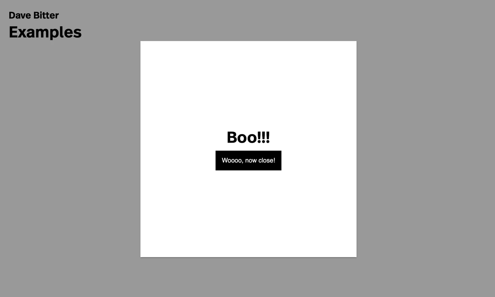
The backdrop-filter property lets you apply graphical effects such as blurring or colour shifting to the area behind an element. Because it applies to everything behind the element, to see the effect you must make the element or its background at least partially transparent. This introduces a new tool to progressively enhance your website or web -application. MDN has a list of all the values you can set. Today, we will take a look at one that my co-worker and CSS wizard Syb Wartna and I recently used in a project. This value is blur-filter. We made a sidebar that would reveal more information after clicking on an item. It was sort of like a modal. For the past few years, there has been one technique that everybody would use. The backdrop, or overlay, would have a slightly transparent, solid, grey colour. Let’s enhance this using the new backdrop-filter! For this example, we are going to build a simple modal. First, we’ll create the version that just displays a backdrop:
    ...

    &[data-overlay='true'] {
        &:after {
            content: '';
            z-index: 101;
            position: absolute;
            top: 0;
            right: 0;
            bottom: 0;
            left: 0;
            background-color: rgba($navy, 0.4);
        }
    }

    ...
 Default backdrop
Then we add one simple CSS property.
Default backdrop
Then we add one simple CSS property.
    ...

    &[data-overlay='true'] {
        &:after {
            content: '';
            z-index: 101;
            position: absolute;
            top: 0;
            right: 0;
            bottom: 0;
            left: 0;
            background-color: rgba($navy, 0.4);
            backdrop-filter: blur(2px);
        }
    }

    ...
 Blurry backdrop
And there we have it. It’s a simple way to quickly enhance the feel of your website or web-application. Just add this property below your default slightly transparent backdrop and you will offer this style as soon as it hits in the browser your user is using. Obviously, this effect is more dramatic with a less empty page. View the demo here. This demo was built with the Mirabeau boilerplate. The source code for this demo can be found at this Gist if you would like to have a look at the final working code.