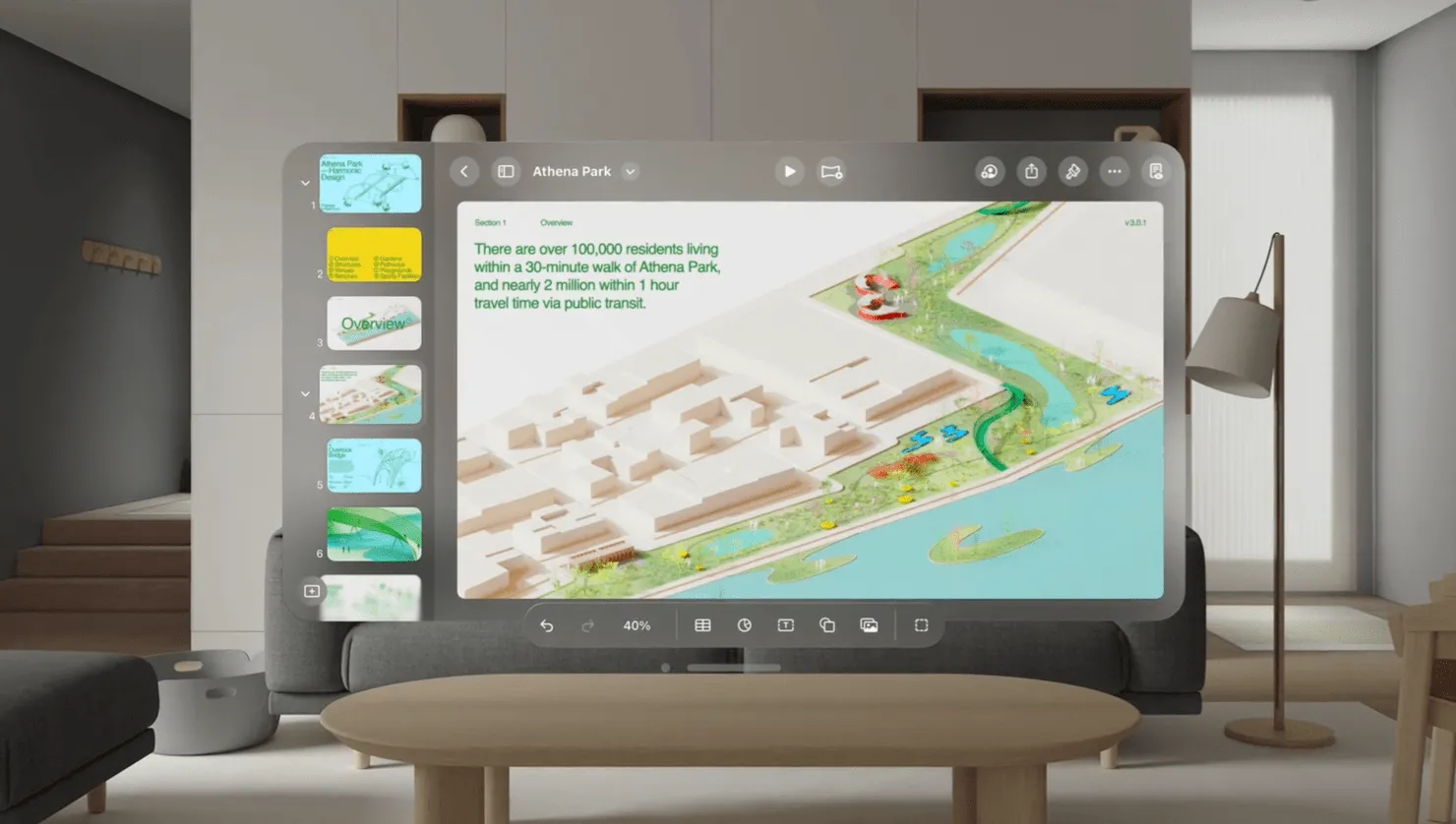
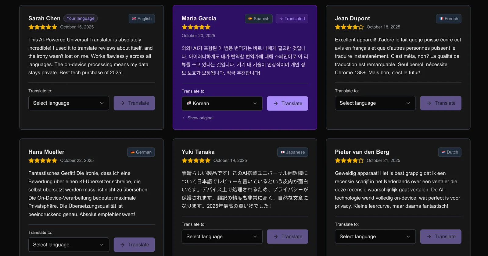
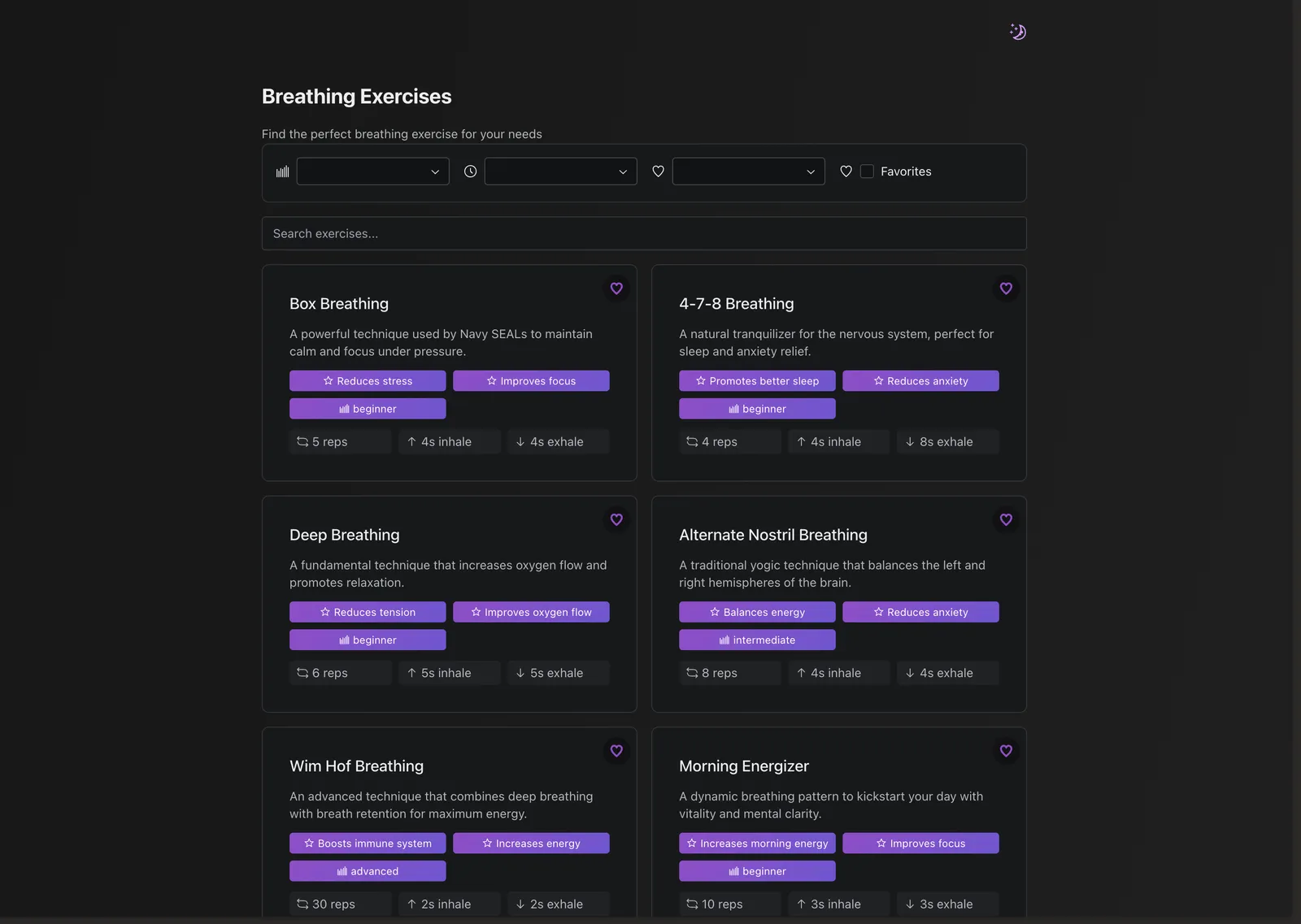
The new Apple Vision Pro has been a lot in the news lately. This new device comes with a new design language in the new VisionOS. One of the key characteristics that stood out to me was the “frosted glass” backgrounds being used everywhere. Whilst looking great, not all people will appreciate this as they may find it difficult to see.
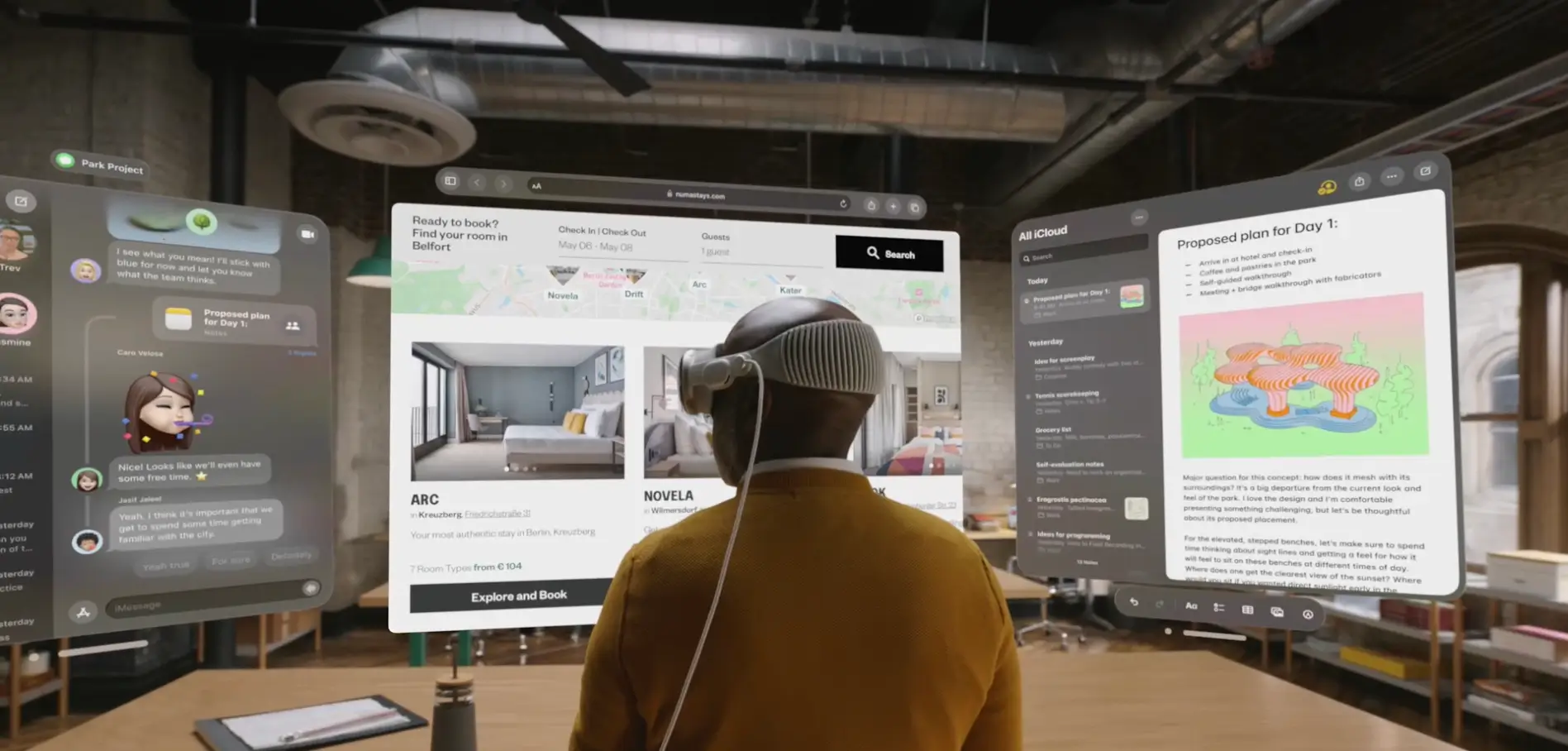
Since the backdrop-filter CSS property was added with a value of blur() we can create the same frosted glass effect on the web. So this got me thinking, is there a way I could still use this, but only when the user doesn’t mind? It turns out, there is a Media Query for that!
prefers-reduced-transparency (experimental)
You can use the experimental Media Query prefers-reduced-transparency to alter your design based on the preference the user sets on their device. This can be either no-preference or reduce and can be changed here:
- In Windows 10/11: Settings > Personalization > Colors > Transparency effects.
- In macOS: System Preferences > Accessibility > Display > Reduce transparency.
- In iOS: Settings > Accessibility > Display & Text Size > Reduce Transparency.
For example, you can do this:
.blurred {
  background-color: rgba(255, 255, 255, 0.2);
  backdrop-filter: blur(4px);
}

@media (prefers-reduced-transparency: reduce) {
  .blurred {
    background-color: rgba(255, 255, 255, 0.8);
    backdrop-filter: blur(10);
  }
}
As you might notice, I don’t completely remove the transparency. I mean, you could, but the key part in this media query is the word reduce. You can still offer the nice design you want, but with the users preference in mind.
Other Media Queries for user preferences
There are a few more Media Queries, some experimental, for user preferences. A quick overview:
prefers-reduced-motion
Many users might feel nauseous when large elements on the screen are animated. They might turn on reduced motion in their system settings. Your browser can detect this and you can provide a reduced version of the animation:
@keyframes slideDown {
  0% {
    transform: translateY(-100%);
  }
  100% {
    transform: translateY(0);
  }
}

@keyframes fadeIn {
  0% {
    opacity: 0;
  }
  100% {
    opacity: 1;
  }
}

.animated {
  animation: slideDown 500ms ease-in-out forwards;
}

@media (prefers-reduced-motion: reduce) {
  .animated {
    animation: fadeIn 200ms linear forwards;
  }
}
Here we still have an animation, but it’s a simple fade of 200 milliseconds.
prefers-contrast
A large portion of you users may find difficulty in reading the text on the screen with low contrast. Besides having a solid contrast as a base, you might want to provide an increased contrast for people who have that setting turned on as they need it. You can increase the contrast for those users like so:
.article {
  background-color: #cfcfcf;
  color: #444444;
}

@media (prefers-contrast: more) {
  .article {
    background-color: #ffffff;
    color: #111111;
  }
}
Naturally, you can change a variety of CSS attributes to increase contrast.
prefers-color-scheme
Probably one of the better known Media Queries is prefers-color-scheme. This Media Query allows you to change the styling based on whether the user is using “light mode” or “dark mode”:
.page {
  background-color: #ffffff;
  color: #111111;
}

@media (prefers-color-scheme: dark) {
  .page {
    background-color: #111111;
    color: #ffffff;
  }
}
prefers-reduced-data (experimental)
The user preferences might not even be visual. By using prefers-reduced-data you can reduce the data consumption of your styling. For example, you might decide to not load a custom font for these user or load a smaller image size for a background-image (or perhaps even none at all):
.header {
  background-image: url('large-image.png');
}

@media (prefers-reduced-data: reduce) {
  .header {
    background-image: url('small-image.png');
  }
}
Work together as developers and designers
Many of these Media Queries require a joined effort from both developers and designers. For example, when implementing the prefers-reduced-motion Media Query, both disciplines have to create an animation with reduced motion together and test it with actual users who’d benefit from this. As developers, I feel it is our duty to raise awareness at the designers we work with about these possibilities on the web to create a better user experience for all!
